If you’ve ever looked at web page performance reports, chances are you’ve focused on average load times (or response times), perhaps glanced at the worst cases (max/min), and maybe moved on. But what if I tell you — to truly understand how your site behaves under load, percentiles + request volume over time are equally (if not more) important?
In this post, I’ll walk through why you should regularly examine detailed response time statistics (not just the average), how response time degrades as load increases, and a practical Python + visualization script that helps you spot bottlenecks.
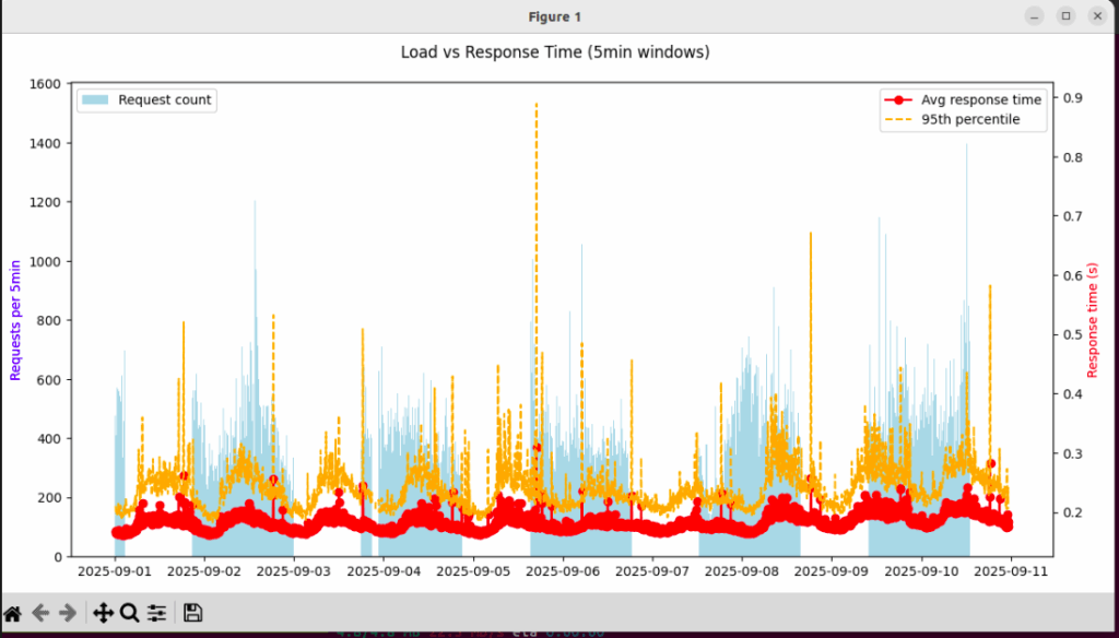
Recently, I gathered response time data every few seconds for my app, and grouped them into 5-minute windows. For each window I measured:
- Number of requests
- Average response time
- Max response time
- 95th percentile response time
The results were eye-opening. The average response time stayed pretty stable most of the time. But the 95th percentile — meaning the slowest 5% of requests — spiked heavily when there were more concurrent requests. That meant that while most users had decent experience, a non-trivial fraction of users were seeing much worse loading times during traffic peaks.
Here’s a screenshot of what that looked like:
Why Percentiles & Request Count Matter
- Average ≠ worst-case: The average smooths out spikes. If 95% of your requests are fast, but 5% are unacceptably slow, you’ll only see that in percentiles.
- User perception is non-linear: A user who hits a 0.5s or 1.0s load at peak feels very differently than someone who always gets 0.2s—even if the average is 0.25s.
- Capacity / scaling insights: By plotting response times against request counts over time, you see the “breaking points” where performance begins to degrade. That helps you decide whether you need more capacity (servers, database replicas, etc.) or optimizations.
- Identifying intermittent problems: Spikes (in tail latency) might correspond with certain events (cron jobs, backups, DB locking, network issues). Average + max alone make it hard to locate them.
Python Script & Visualisation
Here’s a Python script you can use on your machine. It reads a CSV with two columns (time, target_processing_time), like:
time,target_processing_time
2025-09-01T14:15:02.872301Z,0.233
2025-09-01T14:15:03.100123Z,0.187
aggregates it into 5-minute windows counting number of requests, mean, max and 95th percentile, and plots both a time-series and scatter of load vs response time.
import pandas as pd
import matplotlib.pyplot as plt

# ---------- Load & prepare data ----------
# Replace with your file path
df = pd.read_csv("your_file.csv")

df["time"] = pd.to_datetime(df["time"])
df = df.set_index("time")

# ---------- Basic stats ----------
avg_time = df["target_processing_time"].mean()
max_time = df["target_processing_time"].max()

print(f"Average response time: {avg_time:.3f} s")
print(f"Max response time: {max_time:.3f} s")

# ---------- Windowed aggregation ----------
windowed = df["target_processing_time"].resample("5min").agg(
    count="count",
    mean="mean",
    max="max"
)
windowed["p95"] = df["target_processing_time"].resample("5min").quantile(0.95)

print(windowed.head())

# ---------- Visualization ----------
# 1. Time-series of load vs average & p95 response time
fig, ax1 = plt.subplots(figsize=(12, 6))

ax1.bar(windowed.index, windowed["count"],
        width=3/1440, color="skyblue", label="Requests per 5min")
ax1.set_ylabel("Requests per 5min", color="blue")

ax2 = ax1.twinx()
ax2.plot(windowed.index, windowed["mean"], color="red", marker="o", label="Avg response time")
ax2.plot(windowed.index, windowed["p95"], color="orange", linestyle="--", label="95th percentile")
ax2.set_ylabel("Response time (s)", color="red")

fig.suptitle("Load vs Response Time (5-min windows)")
ax1.legend(loc="upper left")
ax2.legend(loc="upper right")
plt.tight_layout()
plt.show()

# 2. Scatter plot: Load vs Avg and P95 response time
plt.figure(figsize=(8,6))
plt.scatter(windowed["count"], windowed["mean"], alpha=0.6, label="Average")
plt.scatter(windowed["count"], windowed["p95"], alpha=0.6, label="95th percentile", color="orange")
plt.xlabel("Requests per 5min")
plt.ylabel("Response time (s)")
plt.title("How response time scales with load")
plt.legend()
plt.show()
When you run this regularly (daily, weekly), you’ll start to see patterns:
- At which request load does the 95th percentile begin to diverge from the average? That’s your stress point.
- Are there certain times of day when the spike is predictable (e.g. 8-9am, or after a job runs)?
- Does adding capacity, cache layers, or optimizing specific endpoints pull down the tail latency?
Key Takeaways
Don’t rely solely on averages or max/min. Percentiles (p90, p95, p99) reveal what many users actually experience under load.
Always view response time in the context of request volume. High performance under low load doesn’t guarantee good performance under high load.
Visuals + automation help. Once you have scripts that produce the plots, it’s easy to track improvements (or regressions) over time.